Analysing and Evaluating Data » Presenting and Processing Data
What you'll learn this session
Study time: 30 minutes
AQA spec: WS 3.1, 3.2, 3.3, 3.4
- Choose between tables, bar charts, histograms and line graphs
- Turn graphs into numbers and numbers into graphs
- Find a mean and a range, and use the right number of significant figures
- Use the range of results about the mean as a measure of uncertainty
🔒 Unlock Full Course Content
Sign up to access the complete lesson and track your progress!
Unlock This CoursePresenting data in a table

Jot results straight into a neat table as you go, with the independent variable in the first column
Results in a mess are hard to use. A results table puts them in order so patterns are easy to spot. Good tables follow a few rules:
- Put the independent variable in the first column and the dependent variable next to it.
- Give every column a heading with its unit, such as "Volume of gas (cm3)". Do not repeat the unit in the table.
- Use the same number of decimal places in a column if the readings came from the same piece of equipment.
- Add a column for the mean if you repeated the experiment.
A frequency table is a different kind of table. It counts how many times each value, or each group of values, turns up. For example, a class tests 20 soil samples and counts how many fall into each pH group.
| pH group | Frequency |
|---|---|
| 4.0 to 4.9 | 3 |
| 5.0 to 5.9 | 9 |
| 6.0 to 6.9 | 6 |
| 7.0 to 7.9 | 2 |
The frequencies add up to 20, which is a quick check that nothing was missed.
Key terms:
- Frequency table: a table that shows how many times each value or group of values occurs.
Bar charts, histograms and line graphs
The kind of data decides the kind of chart. The independent variable is the one you change. It goes on the x-axis. The dependent variable is the one you measure. It goes on the y-axis.
📊 Bar chart
Use it when the independent variable is a category, such as the type of fuel or the name of a metal. Bars have gaps between them.
📈 Histogram
Use it to show a frequency table of groups of numbers, such as the pH groups above. The bars touch because the groups run on from each other.
✎ Line graph
Use it when both variables are numbers, such as time and volume. You plot each point as a small cross and then draw a line through them.
To plot two variables well:
- Choose scales that use more than half of the grid, going up in steps that are easy to read (1, 2, 5 or 10 per square).
- Label each axis with the quantity and the unit.
- Plot every point carefully.
- Draw a smooth line or a straight line through the points. Do not just join the dots with a ruler.
Translating between graphs and numbers
You must be able to move data from one form to another. You might read values off a graph into a table, or turn a table of results into a graph. When you read a value from a graph, check the scale on each axis first. One small square is rarely worth 1.
A straight line graph gives you two useful numbers:
- Slope (gradient): change in y divided by change in x. Always use two points that are far apart on the line.
- Intercept: the value of y where the line crosses the y-axis.
Worked example
A student reacts different masses of magnesium with excess acid and measures the hydrogen made. The line is straight. It passes through (0, 0) and (0.050 g, 50 cm3).
Slope = 50 ÷ 0.050 = 1000 cm3/g. The intercept is 0, so no magnesium gives no gas. The slope tells us that each gram of magnesium gives 1000 cm3 of hydrogen.
For a curve, the slope changes from place to place. To find it at one point, draw a tangent to the curve there and work out the slope of the tangent. This is the rate of change at that point. You met this in the lesson on measuring and calculating rates.
Higher tier only
Finding a rate from the slope of a tangent to a curve is Higher tier. Foundation students only need to read rates from straight lines.
The area between a curve and the x-axis can also mean something. You can measure it by counting squares. What it means depends on the axes. If the y-axis shows a rate in cm3/s and the x-axis shows time in s, the area is rate × time, which is a volume in cm3.
Mean, range and significant figures
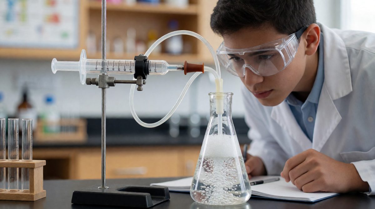
Repeat readings never match exactly, so take a mean to get the best single value
When you repeat a measurement, the results are not identical. The mean (add the results, then divide by how many there are) gives the best single value. The range is the lowest result to the highest result.
Significant figures are the digits that count in a number, starting from the first digit that is not zero. Zeros at the start do not count. 0.004052 has four significant figures. To round to a number of significant figures, look at the next digit: 5 or more rounds up.
- 25.46 to 2 significant figures is 25
- 0.004052 to 2 significant figures is 0.0041
- 3 078 to 2 significant figures is 3 100
Your answer should not have more significant figures than the least precise data you used. A calculator shows many digits, but they are not all meaningful.
Worked example
The mass of a precipitate is measured four times: 1.42 g, 1.38 g, 1.45 g and 1.41 g.
Sum = 5.66 g. Mean = 5.66 ÷ 4 = 1.415 g, which is 1.42 g to 3 significant figures, the same as the readings.
Range = 1.38 g to 1.45 g.
Remember, an order of magnitude is a rough size in powers of ten. It is a quick way to check an answer is sensible.
You may also need to change the subject of an equation, or substitute numbers into it with the right units. For example, if mean rate = quantity ÷ time, then time = quantity ÷ mean rate.
Key terms:
- Significant figures: the digits in a number that carry meaning, counted from the first non-zero digit.
- Slope (gradient): how steep a line is, found as change in y divided by change in x.
- Intercept: the point where a line crosses an axis.
Showing uncertainty
Whenever you make a measurement, there is always some uncertainty about the result. Your results spread out around the mean, and the range of the measurements about the mean is a measure of that uncertainty. The lesson Uncertainty in Chemical Measurements shows how to work it out. For the precipitate results, the readings lie up to 0.04 g either side of the mean, so we can write 1.42 g ± 0.04 g.
A small spread means the results agree closely. A large spread means you should be less sure of the mean. Always show the spread when you present results, not just the mean.
Common mistakes
Putting the dependent variable on the x-axis. Joining plotted points with a ruler when the trend is a smooth curve. Leaving units off axis labels. Reading a scale as if every square is 1. Giving a mean to far more significant figures than the readings.
Exam-style question
A student collects gas from a reaction four times. The volumes are 18.0 cm3, 21.0 cm3, 19.0 cm3 and 20.0 cm3. Calculate the mean and the range. (3 marks)
Model answer
Mean = (18.0 + 21.0 + 19.0 + 20.0) ÷ 4 = 78.0 ÷ 4 = 19.5 cm3.
Range = 18.0 cm3 to 21.0 cm3.
Exam tip
Show your working for every calculation. Marks are often given for the method even if the final answer slips.