🔍 Introduction to Recording, Analysing and Presenting Data
When you go out into the field whether that's a river, a beach, a city street or a forest you're collecting real evidence about the environment. But collecting data is only the start. You also need to record it carefully, analyse it to find patterns and present it so others can understand what you found. These three skills are at the heart of every good fieldwork investigation.
Think of it like being a detective. You gather clues (data), look for connections (analysis) and then explain your findings (presentation). Get these right and you'll be able to answer your investigation question with confidence.
Key Definitions:
- Primary Data: Information you collect yourself, first-hand, during fieldwork. For example, measuring river width or counting litter.
- Secondary Data: Information collected by someone else that you use in your investigation. For example, government pollution statistics or census data.
- Quantitative Data: Data that is numerical things you can count or measure. For example, temperature in °C or the number of cars passing per minute.
- Qualitative Data: Data that describes qualities or characteristics. For example, photographs, sketches or written observations.
- Hypothesis: A prediction or statement that your fieldwork is designed to test. For example, "Water quality decreases downstream."
- Sampling: Choosing a representative selection of data points rather than measuring everything.
📋 Primary Data
You collect this yourself during fieldwork. It's fresh, specific to your location and directly answers your question. Examples include: river discharge measurements, soil pH readings, pedestrian counts, noise level recordings and litter surveys. The big advantage? It's tailored exactly to your investigation.
📄 Secondary Data
This is data already collected by others governments, scientists, charities or news organisations. Examples include: Environment Agency river flow data, Met Office weather records, satellite images and census population figures. It's useful for comparing your findings to wider trends or historical data.
📝 Recording Data in the Field
Good recording is all about being systematic and accurate. If you record data messily or inconsistently, your whole investigation falls apart. Before you go out, you need to plan exactly what you'll measure, how you'll measure it and how you'll write it down.
📄 Data Recording Methods
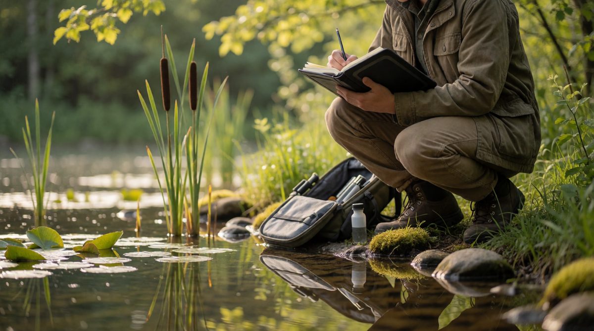
Recording data carefully in the field
There are several tried-and-tested ways to record data during fieldwork. Choosing the right one depends on what you're investigating.
✅ Tally Charts & Counts
Great for counting things like vehicles, people, or species of plants. Simple, quick and easy to use in the field. For example, counting the number of pedestrians passing a point every 5 minutes in a CBD.
📏 Measurement Tables
Used when you're taking readings with equipment like a thermometer, pH meter, or tape measure. You record readings in a pre-prepared table with columns for location, time and measurement value.
🖼 Field Sketches & Photos
Qualitative methods that capture what a place looks like. A field sketch labels key features of a landscape. Photos provide visual evidence. Both are useful for showing environmental conditions that numbers can't fully describe.
🎯 Sampling Strategies
You can't measure everything so you take a sample. There are three main sampling strategies used in iGCSE fieldwork:
🎲 Random Sampling
Sample points are chosen completely by chance for example, using random number tables or a random number generator. This removes bias but might miss important areas. Good for: soil surveys, plant distribution studies.
📈 Systematic Sampling
Samples are taken at regular intervals for example, every 10 metres along a river or every 5th person who walks past. This gives even coverage of an area. Good for: transects along a beach or river.
👥 Stratified Sampling
The population is divided into groups (strata) and samples are taken from each group in proportion. For example, if 60% of an area is grassland and 40% is woodland, you'd sample in those proportions. Good for: land use surveys.
🌎 Real Fieldwork Example: River Investigation
A group of students investigated whether water quality changes along the River Wye in Wales. They used systematic sampling, taking measurements every 500 metres downstream. At each point they recorded: water temperature (°C), pH level, dissolved oxygen (mg/L), turbidity (cloudiness) and flow speed (m/s). They used pre-prepared data tables and took photographs of each site. This gave them both quantitative and qualitative data to compare.
📊 Analysing Your Data
Once you've collected your data, it's time to make sense of it. Analysis means looking for patterns, trends, anomalies and connections in your data. You're trying to answer: does the data support your hypothesis or not?
Key Analysis Techniques:
- Mean (Average): Add up all values and divide by the number of readings. Useful for summarising data. For example, average river width across 10 sites.
- Median: The middle value when data is arranged in order. Less affected by extreme values (anomalies).
- Mode: The most common value in a data set.
- Range: The difference between the highest and lowest values. Shows how spread out your data is.
- Percentage Change: Shows how much something has increased or decreased. Formula: ((New Value − Old Value) ÷ Old Value) × 100.
- Identifying Anomalies: Anomalies are results that don't fit the pattern. You should note them and try to explain why they occurred for example, a sudden spike in pollution near a factory outlet.
🔎 Spotting Patterns and Trends
A trend is a general direction that data moves in for example, temperature increasing as you move further from the coast. A pattern is a repeated relationship in the data for example, litter levels are always higher near fast food outlets. When you analyse data, always ask:
- Is there a clear increase or decrease?
- Are there any exceptions (anomalies)?
- Does the data match your hypothesis?
- Are there any correlations between two variables?
💡 What is a Correlation?
A positive correlation means as one variable increases, so does the other. For example, as distance from a city centre increases, green space increases. A negative correlation means as one increases, the other decreases. For example, as distance from a factory increases, air pollution decreases. No correlation means there's no clear relationship between the two variables.
🖼 Presenting Your Data
Choosing the right presentation method is just as important as collecting the data. The wrong type of graph or map can make your data confusing or misleading. Here's a guide to the most common methods used in iGCSE Environmental Management fieldwork.
📊 Graphs and Charts
📈 Line Graphs
Best for showing change over time or continuous data. For example, plotting river discharge over 12 months, or temperature change throughout the day. Always label axes with units.
▮ Bar Charts
Best for comparing different categories. For example, comparing average litter counts at five different sites, or rainfall totals in different months. Bars should be the same width with gaps between them.
⭕ Pie Charts
Best for showing proportions how something is divided up. For example, land use in a study area (40% residential, 25% green space, 35% commercial). Only use when you have percentage data that adds up to 100%.
🔲 Scatter Graphs
Used to show the relationship (correlation) between two variables. Plot one variable on the x-axis and the other on the y-axis. Each data point is a dot. Then draw a line of best fit. For example: distance from city centre (x) vs. noise level in dB (y). The line of best fit shows whether the correlation is positive, negative, or absent.
🌍 Maps and Choropleth Maps
Maps are ideal for showing spatial patterns how something varies across an area. A choropleth map uses shading to show data values across regions (darker = higher values). For example, shading areas by air pollution levels or population density. Always include a key, scale and north arrow.
🖼 Other Presentation Methods
- Proportional Symbols: Circles or squares drawn to scale on a map to show quantities for example, the size of a circle showing the volume of waste produced in different areas.
- Divided Bar Charts: Show how a total is split into categories across different locations or times.
- Annotated Photographs: Photos with labels pointing out key environmental features great for qualitative data.
- Transect Diagrams: A cross-section diagram showing how conditions change across a line for example, vegetation types from a sand dune coast inland.
🌍 Case Study: Coastal Fieldwork in Norfolk
Students investigating coastal erosion at Happisburgh, Norfolk, used a range of presentation methods. They drew a transect diagram showing cliff height and beach width at five points along the coast. They used a bar chart to compare erosion rates (metres per year) at each site. Annotated photographs showed evidence of undercutting and slumping. A choropleth map showed which sections of coastline were retreating fastest. By combining these methods, they could clearly show both the scale and location of erosion.
📋 Drawing Conclusions and Evaluating
The final stage of any fieldwork investigation is writing up your conclusions and evaluation. This is where you explain what your data actually means.
A good conclusion should:
- Refer back to your original hypothesis was it supported or not?
- Describe the main patterns and trends you found
- Explain any anomalies in the data
- Link your findings to geographical theory or wider knowledge
A good evaluation should:
- Identify any limitations in your data collection for example, only sampling on one day, or having a small sample size
- Suggest how the investigation could be improved for example, taking readings at different times of year
- Comment on the reliability of your results were they consistent?
- Consider whether your results can be generalised beyond your study area
⚠ Common Mistakes to Avoid
❌ Don't just describe your graph explain what it means.
❌ Don't ignore anomalies always try to explain them.
❌ Don't forget units on graph axes.
❌ Don't confuse correlation with causation just because two things are linked doesn't mean one causes the other.
✅ Always link your conclusion back to your hypothesis.
📚 Quick Revision Summary
- 📋 Record: Use tally charts, measurement tables, field sketches and photos. Choose random, systematic, or stratified sampling.
- 📊 Analyse: Calculate mean, median, mode, range. Look for trends, patterns, correlations and anomalies.
- 🖼 Present: Choose the right method line graphs for trends over time, bar charts for comparisons, scatter graphs for correlations, maps for spatial data.
- 📝 Conclude: Refer back to your hypothesis, explain patterns and discuss anomalies.
- 🔍 Evaluate: Be honest about limitations and suggest improvements.